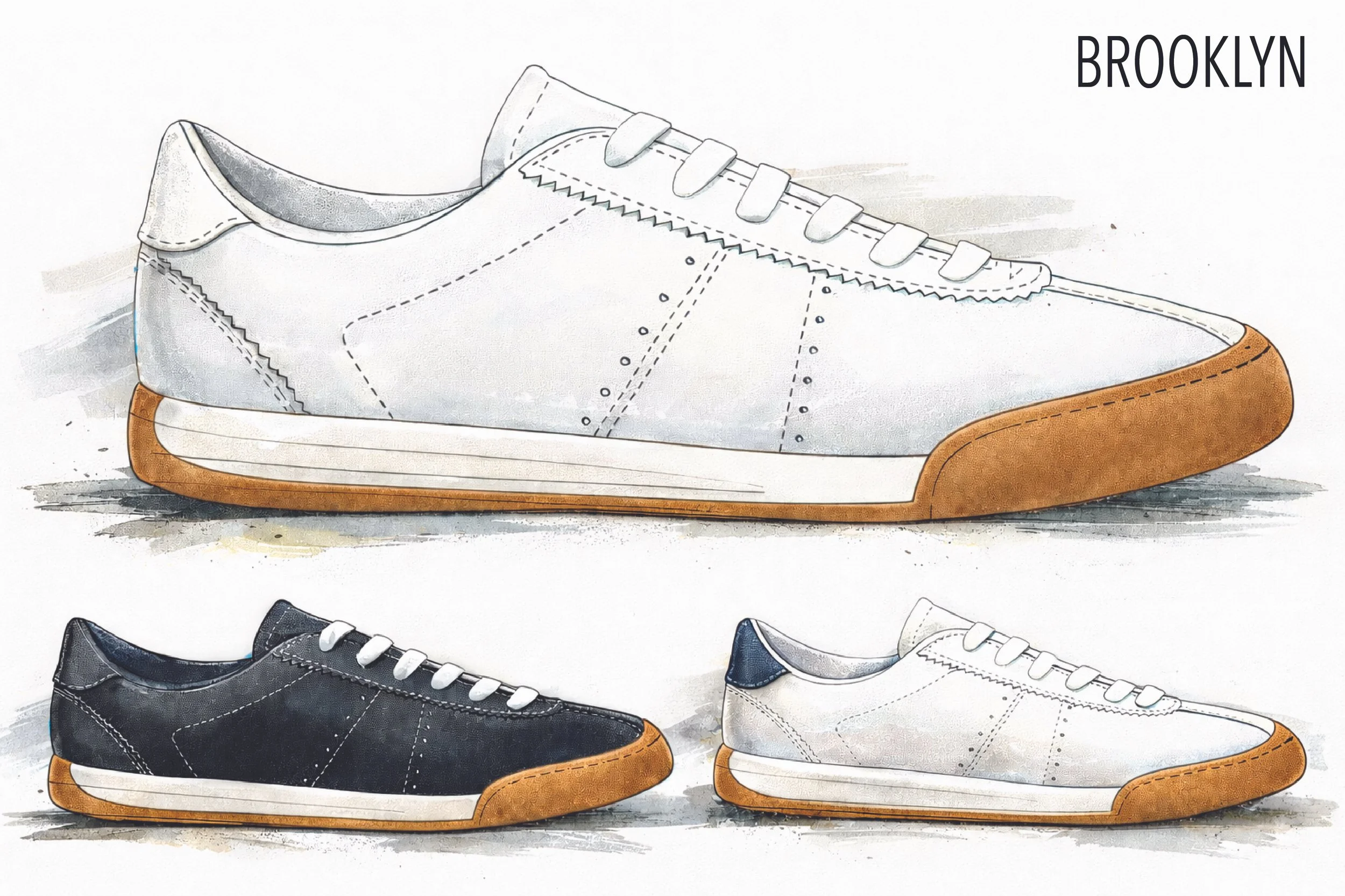
GREATS BROOKLYN
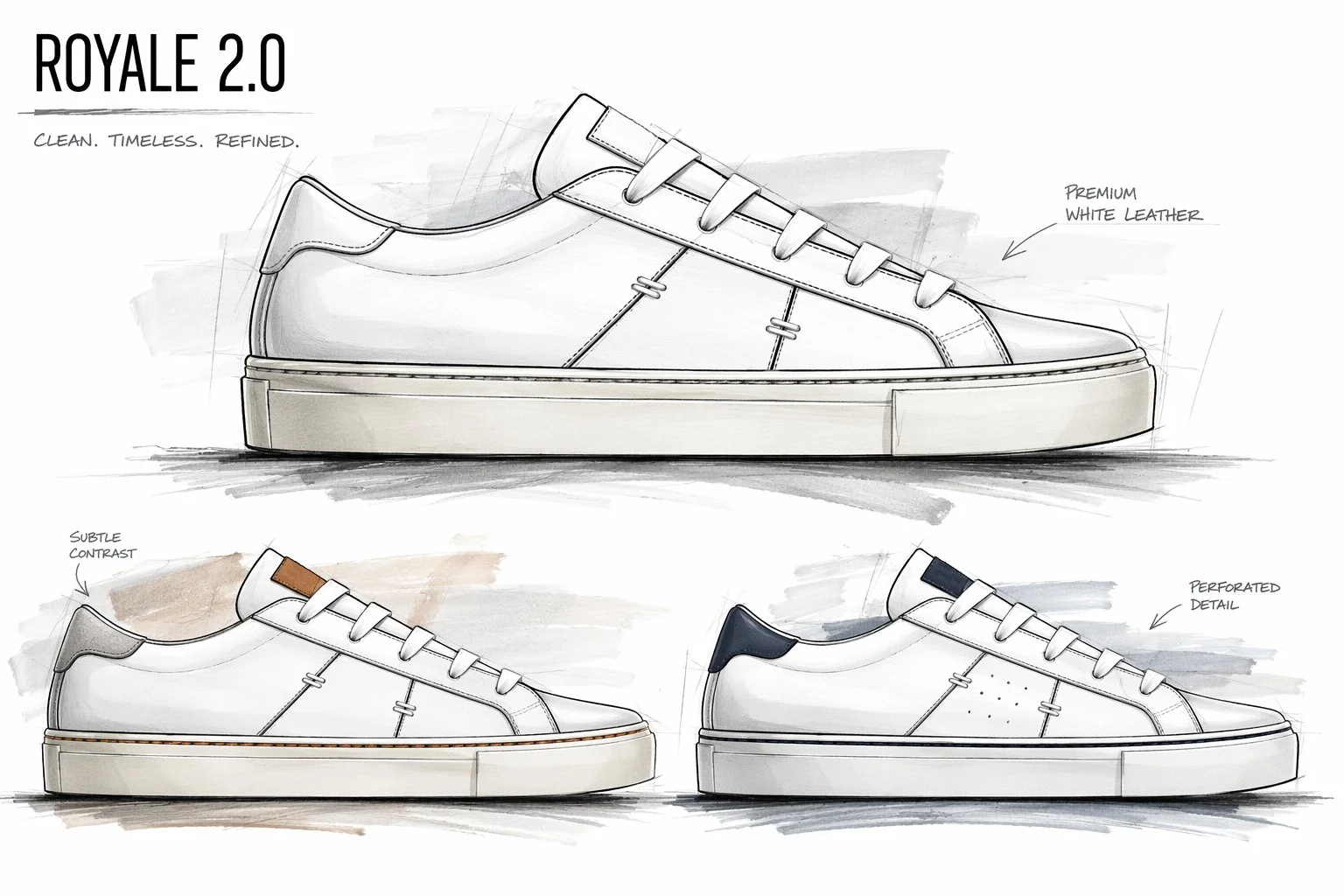
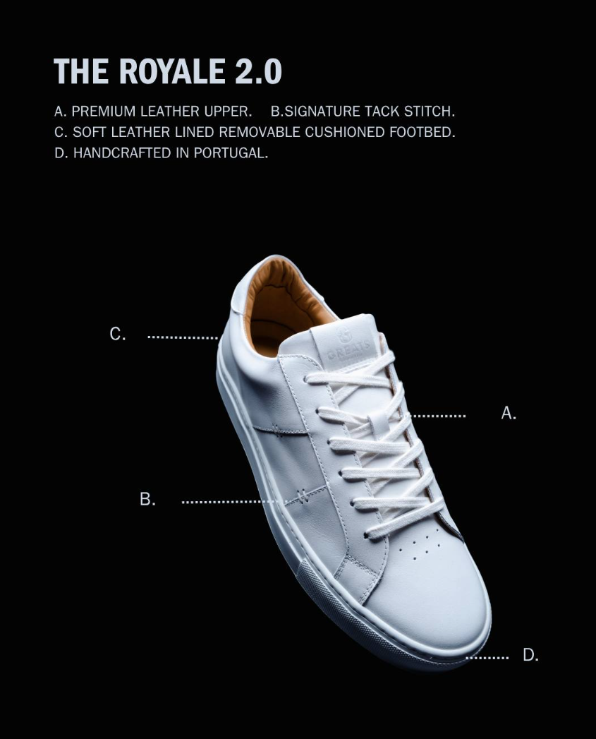
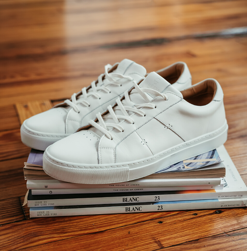
The Royale 2.0 was designed to evolve a Greats icon without losing its soul. When I joined the brand, my goal was to modernise the silhouette while preserving the heritage details that made the Royale recognisable. I refined the proportions with a faster side panel, reshaped the last for a more contemporary fit and feel, and reworked the signature “G” branding, drawing inspiration from the 1920s Brooklyn Dodgers logo. The result is a cleaner, more current expression of an essential Greats classic.

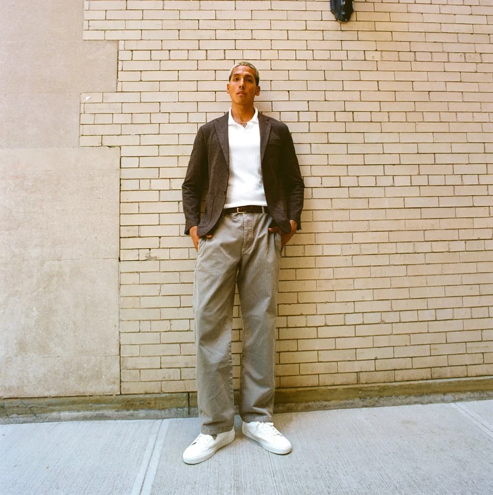
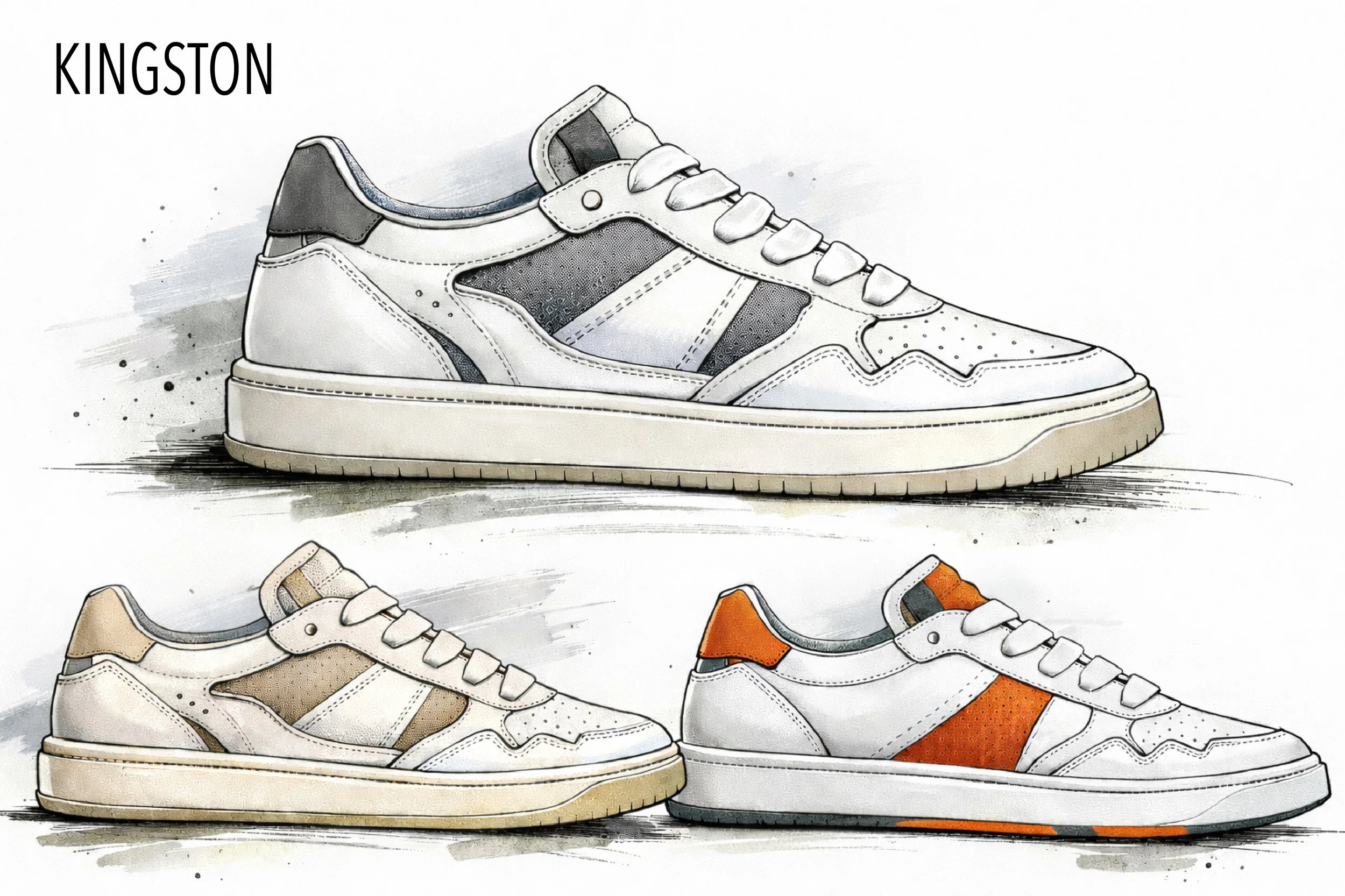
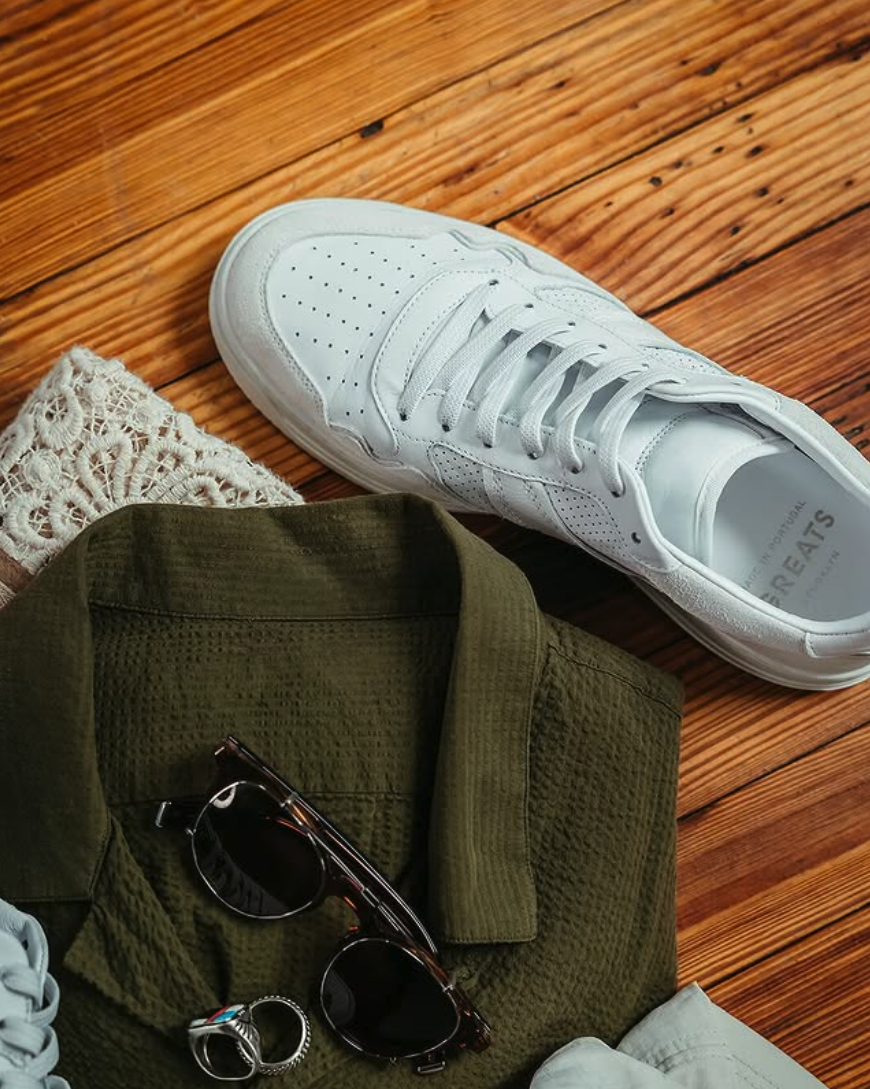
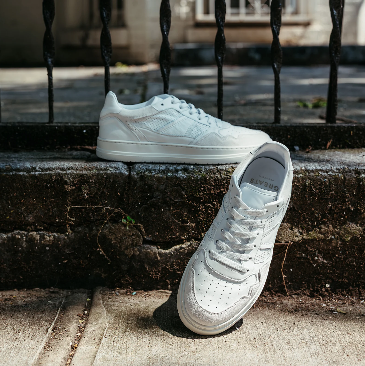
The Kingston was designed to bring classic court style into a more modern, comfort-driven space. Handcrafted in Portugal, it combines premium goat leather, a soft leather and TENCEL lining, Strobel construction, and a custom flex sole to create a sneaker that feels exceptionally light, flexible, and easy to break in. I focused on building an everyday style that could compete with timeless court silhouettes while delivering a more ergonomic fit and all-day comfort right out of the box.
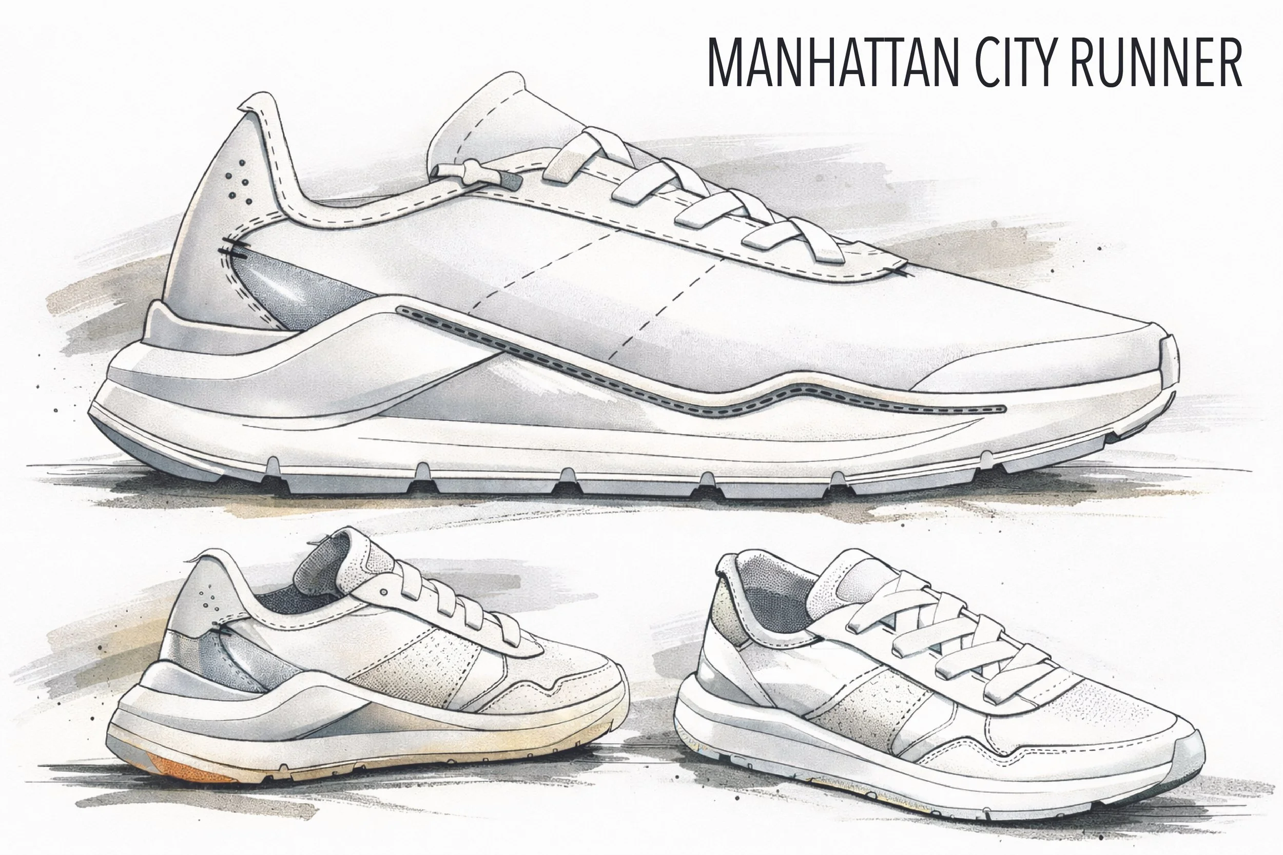
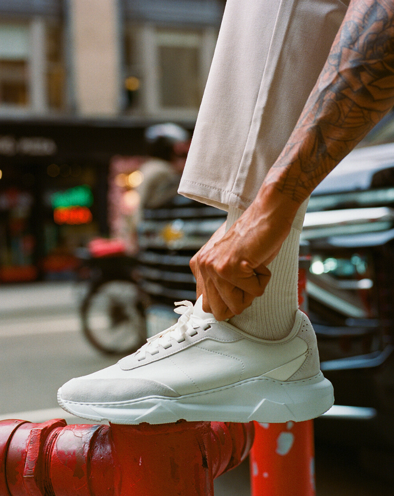
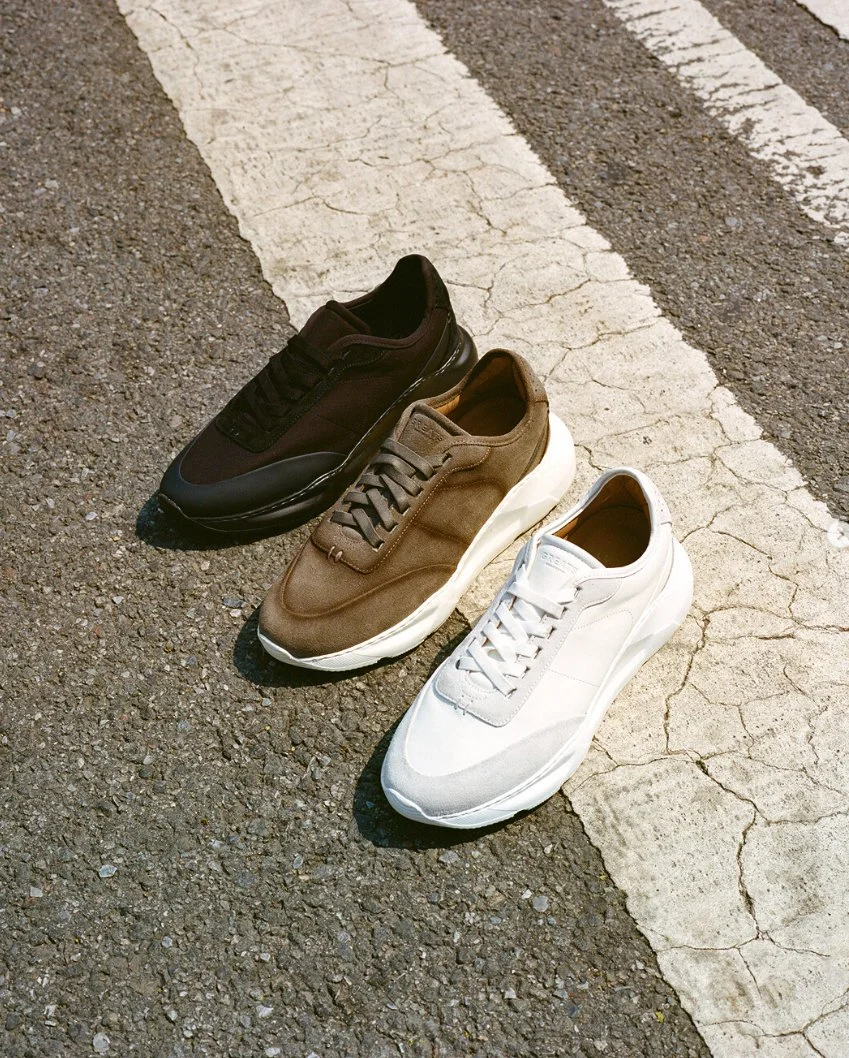
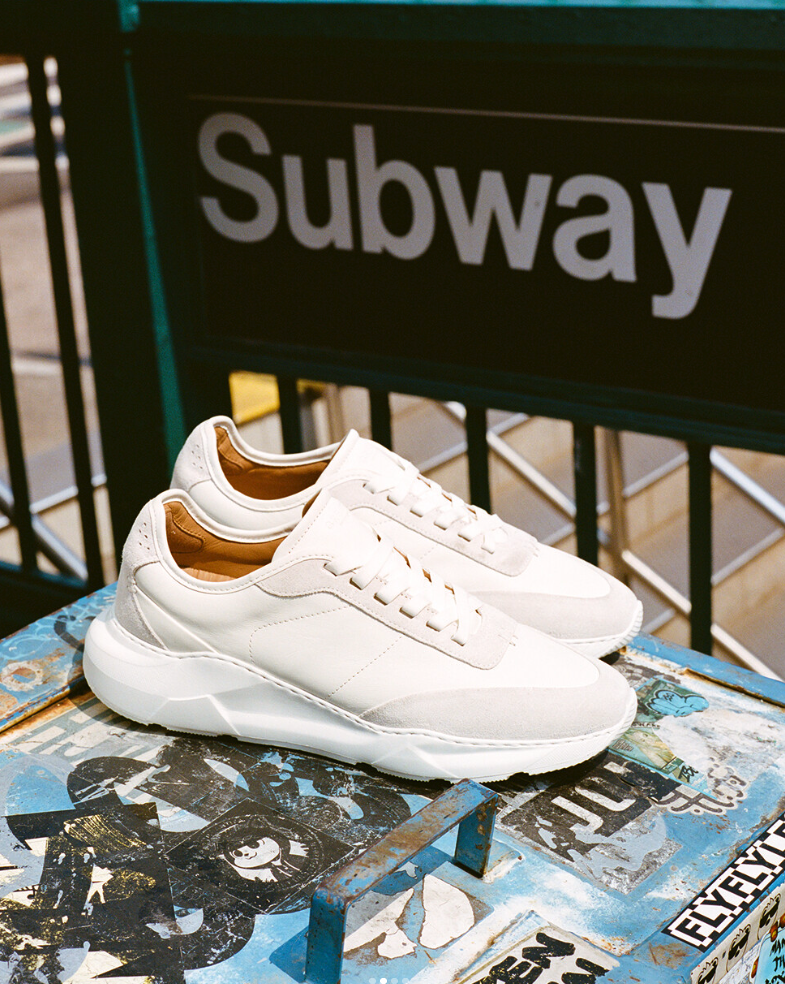
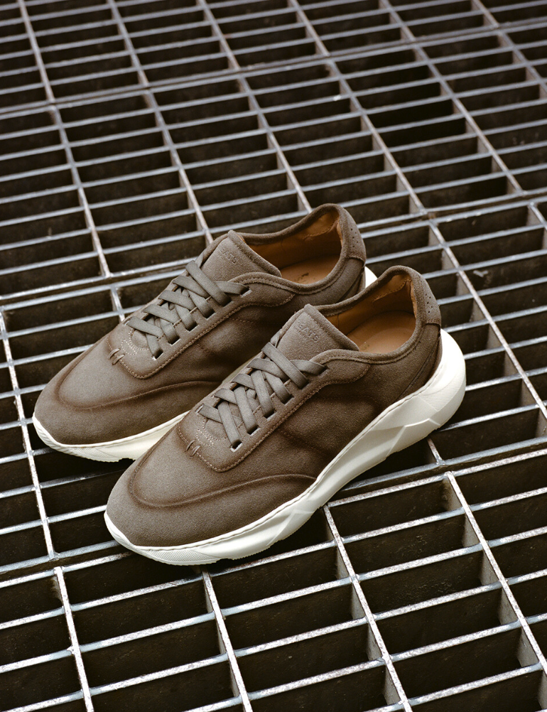
The Manhattan City Runner was designed as a versatile, running-inspired sneaker built for everyday urban life. My goal was to create a style that delivered the comfort and ease of an athletic shoe while elevating it with a more luxurious perspective. Crafted in Portugal with premium leather and suede, signature tack stitch detailing, a lightweight EVA outsole, and a cushioned leather lined footbed, it was made to feel easy to break in, effortless to wear, and refined enough to move seamlessly through any part of the day.
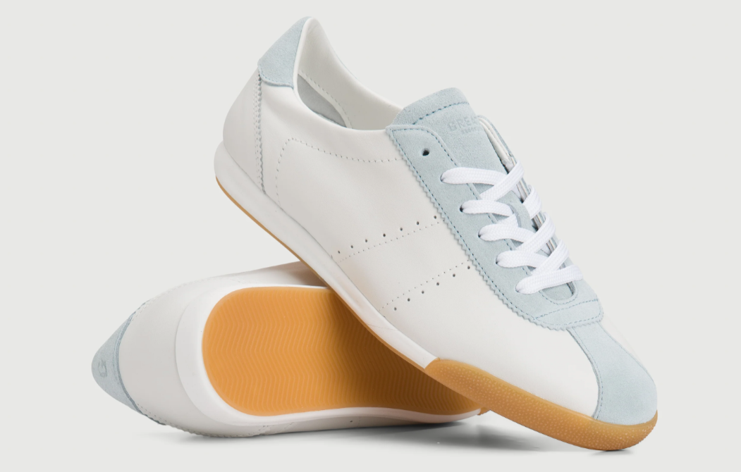
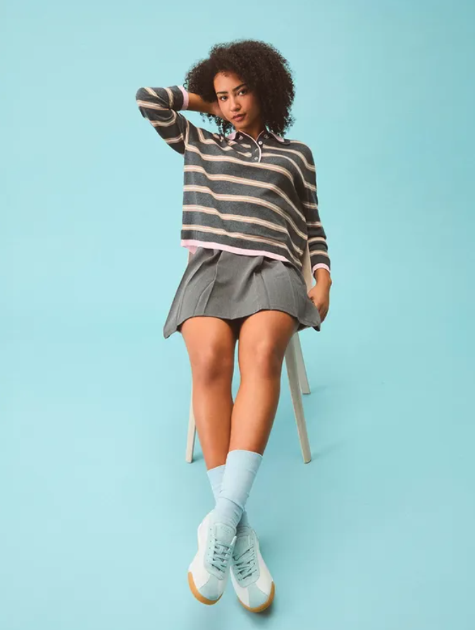
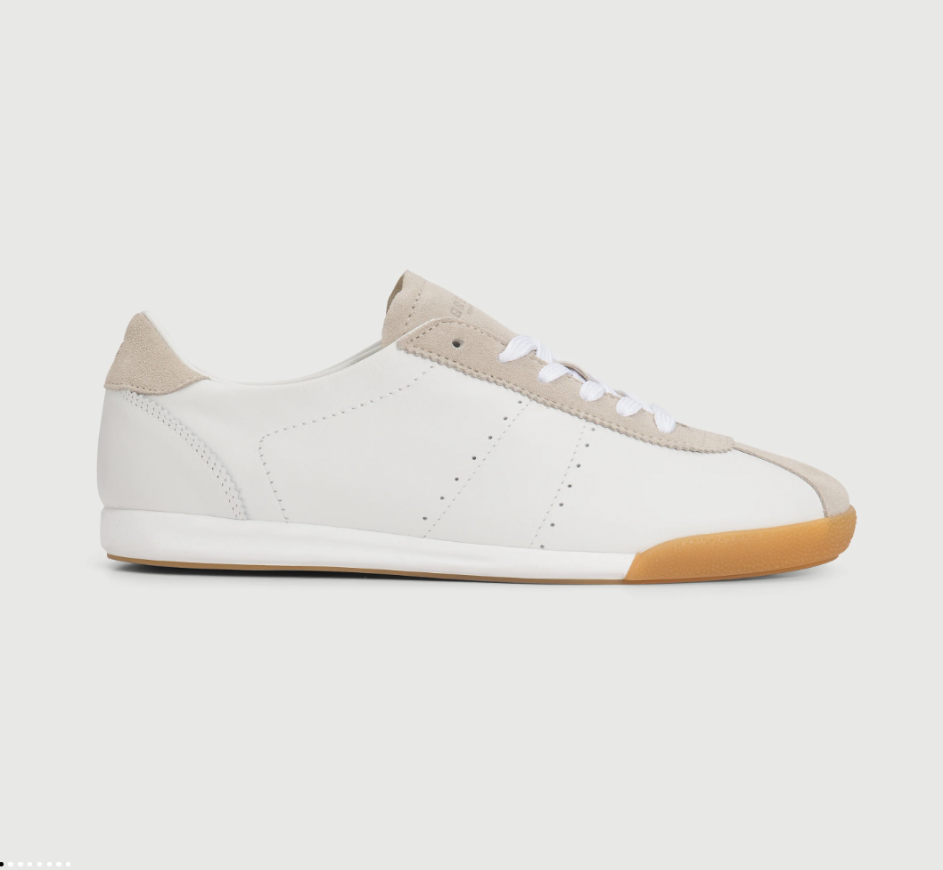
The Brooklyn was designed as the first step in a new women’s direction for GREATS, an evolution into a fresher, more trend-right expression of premium sneakers. I wanted it to feel effortless, versatile, and polished, with a low-profile silhouette, soft leather and tonal suede, and a subtle wedge for all-day comfort. Inspired by retro heritage but made for modern city life, the Brooklyn brings a refined sense of ease to the everyday and marks the beginning of a new era for the brand’s women’s collection.
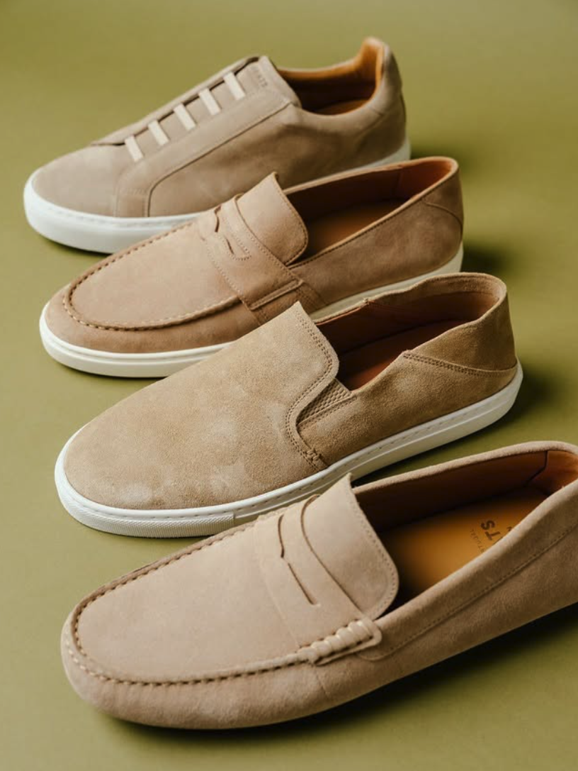
GREATS Slip On Collection: a refined lineup built for movement without compromise. Featuring the Paros Loafer, Royale 2.0 Slip-On, Corsa Driver, and Reign Slip-On, each silhouette delivers comfort, versatility, and understated luxury. From the relaxed sophistication of the Paros Loafer to the modern icon status of the Royale 2.0 Slip-On, every pair is handcrafted in Portugal or Italy using premium materials and precision construction. The Corsa Driver channels classic driving heritage with a contemporary edge, while the Reign Slip-On redefines everyday wear with its clean lines and effortless functionality. Flexible constructions, streamlined profiles, and elevated detailing make this collection your go-to for everything from city days to weekend escapes. No laces. No limits. Just timeless style, made simple.